Get your special edition PR Crisis eBook
To see examples of data visualizations in action, download our free PR Crisis Management eBook.
Big data has exploded! Google receives almost 4 million search queries every minute. We’re generating over 205 quintillion bytes of data every day. Translating this information into actionable insights that bring an ROI, is complex, to say the least.
Give data visualization a welcoming hug.
After raw data is collected - sales figures, social media data, campaign stats, consumer intelligence - it needs to be visualized so it’s easy to understand and business goals can be met head on.
For this you need the best data visualization tools. You'll find 16 in this post.
We respond well to images, processing visual data 60,000 times faster than text. Good data visualization will translate complicated datasets demonstrating a clear and concise message.
Press release - Totino’s teams up with Call of Duty franchise press.
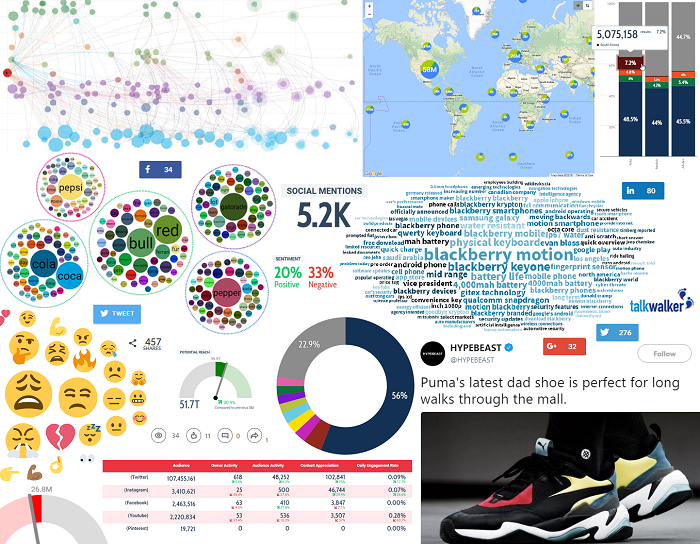
Talkwalker virality map - how the PR spread off and online.
Understanding the story behind the data - data storytelling - makes data visualization an essential part of your marketing toolkit. For sharing, communicating, and interpreting information. Graphical representation of your data - from a simple bar chart to a multidimensional data map - will help you understand trends, patterns, brand performance, impact of new strategies, and more.
Data visualization tools take complex information, then display and interpret it visually. Easy to understand images that deliver your message clearly.
Images work as a global language. Breaking down communication barriers. A baffling page of scientific data that could lose you a sale, becomes a funky graphic that might win you a conversion. Your data scientists communicating their findings with visuals so that the rest of your organization can understand the findings.
Don’t scare people with overly-complicated information!
In the past, an Excel spreadsheet would suffice, but we’ve moved on from there. We have the tools to create powerful and easy-to-understand visuals. Visuals that speak to your audience and convey your message without misinterpretation.
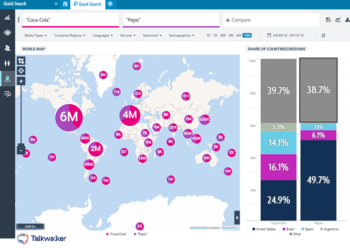
Quick Search - Coca-Cola & Pepsi share of countries/regions.
Imagine all this information in an Excel spreadsheet. Ouch!
I have a heap of dataviz tools for you to try, but first I’m going to explain what data visualization is. Why it’s an essential part of your marketing strategy, best practices, and more.
Let’s stop wasting time...
Table of contents
- What is big data?
- Definition of data visualization
- 8 benefits of data visualization
- What makes good data visuals?
- Examples of data visualizations
- How to choose data visualization tools
- 16 of the best data visualization tools
What is big data?
Big data is cool! It reveals our everyday behavior. Where we go, the shops we like, what we’re buying, the websites we visit, how long we spend there.
Brands winning at data visualization include Amazon, Google, and Netflix. Visit a website and guaranteed you’ll see a pop-up for a pair of shoes you looked at on Amazon. Watch a movie and Netflix will be able to recommend your next one.
What are they doing that's working? Analyzing their customers' behavioral data to improve the CX, by personalizing the shopping experience.
Big data is any large volume of raw data - structured and unstructured - that can be collected, stored, and analyzed. To reveal patterns and trends relating to behavior. Sources of big data are…
- Social media data on engagement, comments, sentiment
- Streaming data from connected devices - IoT
- Publicly available open sources such as .GOV websites, EU Open Data Portal, etc.
The amount of data you have is irrelevant. What’s important is what you do with it. Combine your data with analytics, and you’ll be able to …
- Find the root causes of crises, failures, defects in near-real time (NRT)
- Offer promotions, based on customers’ purchasing behavior
- Identify fraudulent activities before they damage your brand reputation
To better analyze and understand the data you collect, you need to make it coherent.
Data visualization is key. Visuals - charts, infographics, graphs, heatmaps - make the data easier to understand. Good and bad data will be identified, so you can maximize productivity. Gain insights from trending topics, such as customer demographics and behavior.
Definition of data visualization
Data visualization comes from several disciplines, including information graphics, statistical graphics, information visualization, scientific visualization.
Translating data from raw figures into a graphical representation - communicating information clearly to users. From basic loading of data into a spreadsheet, to bringing multiple visuals together - graphs, charts, maps, etc. - onto a dashboard.
Data visualization allows us to see and analyze insights, trends, and patterns that would otherwise be buried under heaps of data.
Check out this awesome, interactive periodic table of data visualization, showing the examples of data visualization methods, including data, information, concept, strategy, metaphor, and compound...
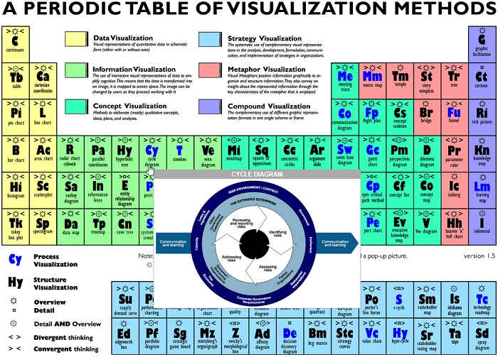
Examples of dataviz - a marriage of art and science.
Visual Literacy - interactive periodic table of visualization methods.
8 benefits of data visualization
- Overall view of brand performance
- Analyze data in seconds
- Data-driven decision-making
- Customer behavior analysis
- Identify trends and patterns
- Share insights across organization
- Deliver a clear message to your audience
A study showed that only 10-20% of written/spoken content is remembered, while 65% is remembered if displayed visually.
There’s a heap of data out there, that if analyzed, provides insights to help us make informed business decisions.
Data visualization takes highly complex information and transforms it into easy-to-understand visuals, that our puny brains can understand and remember. The end benefit of dataviz being the ability to drive strategic decision-making.
Here’s what dataviz can do for you and your business...
See the whole picture
Data collected relating to your performance - transactions, behaviors, interactions, etc. - means you’ll see trends and patterns, giving you an overall view of how your business is performing.
Save time
Dataviz computer graphics and charts allow you and your audience to analyze heaps of information in seconds.
Informed decision-making
Back your business decisions with tangible insights. Visual clarity of your campaign performance - what’s working, what isn’t - helps you quickly identify insights that’ll enable better strategy planning. What needs improving. What you should be monitoring. Where to target your resources. Faster decision-making will enable your business to be more competitive in the marketplace.
Customer behavior analysis
Gain deeper insight into consumer sentiment and behavior, and improve CX.
Identify trends
Spot changes and trends - in real-time - in your customer and market data. Quickly address potential crisis situations and solve them before they affect your bottom line.
Jump on trending topics with relevant content and increase engagement with your audience.
Identify patterns
Faced with a visual, it’s easier to see patterns in your data. This means you’ll be able to focus on areas that could influence the performance of your business.
Communicate data across the board
Data visualization makes it a whole lot easier to share insights across your organization. From sales and marketing, shareholders, partners, and exec level.
Deliver a clear message
Delivering insights to your audience with data visualizations adds credibility to your content, and ensures full comprehension.
What makes good data visuals?
Attention grabbing. Easy to understand. Obvious. Visualized data without text, telling your story..
Remember? Global language, breaking down barriers.
Examples of data visualizations
Back in the day, taking information from an Excel spreadsheet and transforming it into a pie chart, was basic data visualization. While this is still effective, we now have way more choices and can create detailed visuals.
Choose your visual wisely. Consider the complexity of your data and how familiar your audience is with big data analytics.
Here are examples of data visuals you could use...
Column chart
Comparing items over a horizontal time frame.
Talkwalker time lapse - results over time by topics. Wow - look at Coca-Cola go!!!
Bar chart
Survey data, responses, non-date based
Talkwalker sentiment analysis results. Pepsi best watch that negativity.
Pie charts and doughnuts
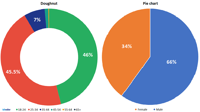
Talkwalker pies & doughnuts - Coke drinkers demographics.
Doughnut - age. Pie chart - gender.
Timeline
Data presented along a line in chronological order. Milestones in a project, business developments, historic events, etc. Providing a broad overview of a sequence of events in time.
Venn diagram
Compare and contrast ideas and concepts. Great for showing relevant overlapping pieces.
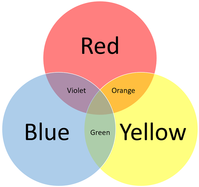
I can see a rainbow.
Gantt chart
A project management visualization technique that shows the different stages of a project - kick-offs and deadlines over a specified timeline. Organize your tasks, team, timings, etc.
Line chart
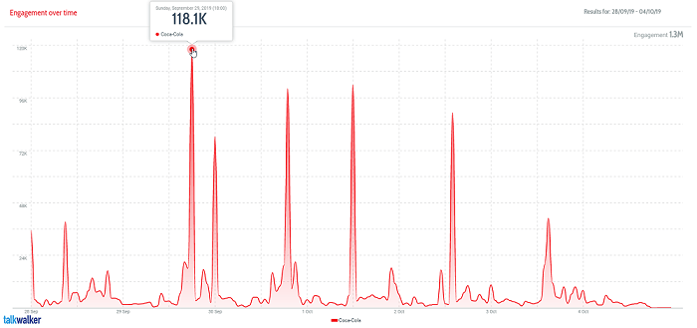
Lots of data points - revealing a trend, monitoring spikes, progress over time.
Talkwalker line chart - engagement over time.
Coca-Cola can dig deep into the spikes to find the cause of the spikes.

Ooh... an experiment combining Coca-Cola and Mentos. What could possibly go wrong?
Fizztastic!
Infographic
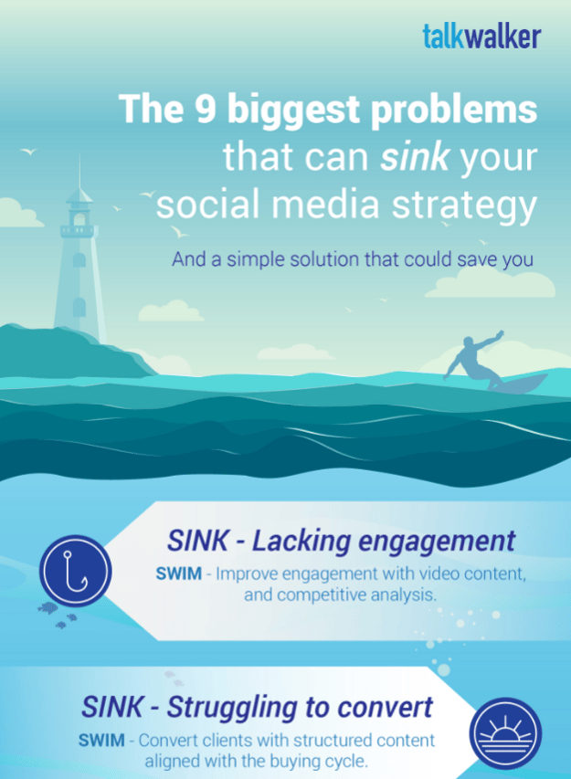
Not just a pretty picture, an infographic is an efficient way to tell your audience a story. A combination of images and words, they allow readers to quickly understand complex topics. According to HubSpot, blog articles with infographics generate an average of 178% more inbound links and 72% more views than all other posts.
Social media marketing strategy - sink or swim - infographic.
Dashboard
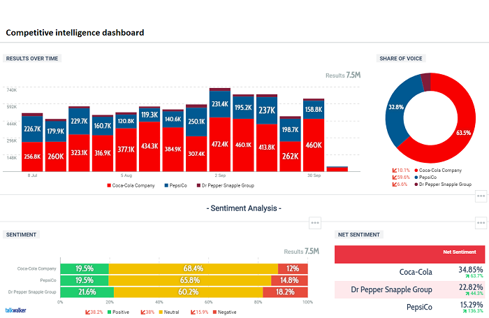
Charts, graphs, etc., brought together on a single dashboard.
Talkwalker Analytics competitive intelligence dashboard.
This list could go on and on, but I think you get the idea…
Treemap charts, ring charts, dendrogram, node-link diagrams, matrix charts [red and blue], parallel coordinates plot, histograms, cartograms, heat maps… I think that’s enough.
How to choose data visualization tools
Data visualization software is a business tool that mines, manipulates, and analyzes raw data. It then converts the data into visuals - charts, tables, graphs, etc.
Data visualization tools will turn your raw data into user-friendly insights that your entire organization can understand.
Before rushing out and wasting money on the wrong data viz tools, you need to identify your goals. Your audience. How much data you’re talking about. What you’re trying to communicate with your visuals. Let’s look at the questions you have to ask yourself to find the right tool. A tool that includes both visualization and analysis...
- How large are your datasets?
- Does your data need to be aggregated first, or imported in its raw state?
- How many data sources do you have?
- What’s the quality of your data?
- Do all your data sources need to be available in a single dashboard?
- How will you import your data into your tool?
- Do you need to automate and share reports?
- How often will you require updated reports?
- Who is your audience and what’s its understanding of data analysis?
- Do you need to be able to download the underlying data as a spreadsheet?
And now... the part you've all been waiting for...
16 of the best data visualization tools
Businesses are getting better at collecting and analyzing data. Explaining what it means and pulling out actionable insights, can still cause frustration. Data visualisation tools use algorithms to create visuals from your data that humans can more easily understand.
Let’s take a look at the dataviz tools you’ll need to exploit your data...
Talkwalker Analytics | Dataviz & analytics
It can be hard to translate data into something that’s understood throughout your organization. Don’t assume everyone understands data analysis. You need to be able to explain what each team’s doing and the results you’re achieving. Visually comprehensive reporting will demonstrate clearly… to everyone… IT team to C-level.
Talkwalker Analytics - use a mix of visuals to support and explain your results.
Use graphs, charts, word clouds, steam graphs, virality maps, even social media messages - whatever it takes to give your reports clarity. To make them visually appealing and understandable on every level.
Human brains understand images and are more likely to retain the information they’re illustrating. Include a short description of what they’re seeing, along with takeaways and analysis highlights.
Features include…
- Time lapse graphs
Talkwalker Time lapse graph - Coca-Cola engagement split across channels.
- Bar charts
- Pie charts and doughnuts
- Line charts
- Steam graphs
- Theme clouds - hashtags, words, logos, scenes, objects, emoji
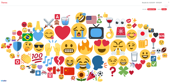
Talkwalker emoji cloud - Coca-Cola, Pepsi, Dr Pepper - one week’s results.
You name it, we’ve got it!
Tableau | Interactive data visualization
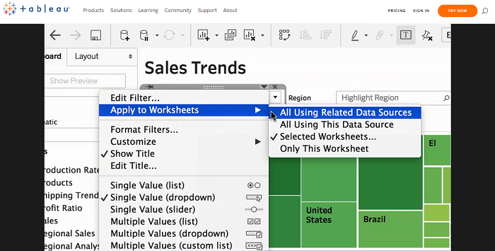
Powerful, secure, and flexible end-to-end analytics platform for your data.
Focused on business intelligence, the Tableau platform helps brands turn data into insights to drive action.
A user-friendly platform, able to integrate with database solutions that include Amazon AWS, MySQL, and Talkwalker. Meaning it’s able to efficiently handle large and rapidly changing datasets.
You’ll have access to a wide range of visuals that can be incorporated into an interactive dashboard.
Visualizations can be shared across your organization, giving everyone the opportunity to pull out insights and make data-driven decisions.
Features include…
- Mobile friendly - transfer your data to any device
- Security permission access - choose user access according to security level
- Interactive, visual analysis - powered by VizQL technology
- Access data and analytics from anywhere - on premise or in the cloud
DataHero | Business intelligence software
Use DataHero to create intuitive charts, reports, and KPI dashboards. Turning siloed business data into actionable insights, that you can then share with your colleagues.
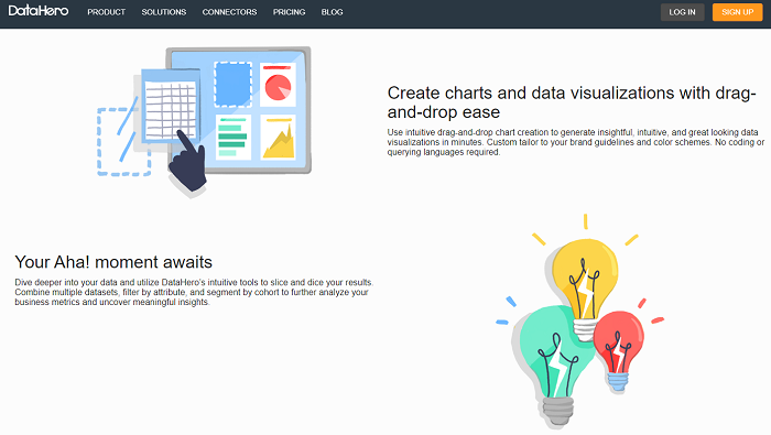
Dynamic data visualization tool allowing you to easily access and analyze your data.
Features include...
- Import data from cloud-hosted services - Salesforce, MailChimp, Google Analytics, HubSpot, Facebook Ads, Google Adwords, Marketo, etc. - to store in a centralized location
- Drag-and-drop graphic design - chart suggestions based on your data, or create customized data visuals and dashboards
- Collect data from multiple sources - provides a unified source of truth to have a clear understanding of the end-to-end story
- Automatic scheduled data refreshes - to ensure your entire team is monitoring and analyzing the same KPIs
Qlick Sense | Data analytics platform
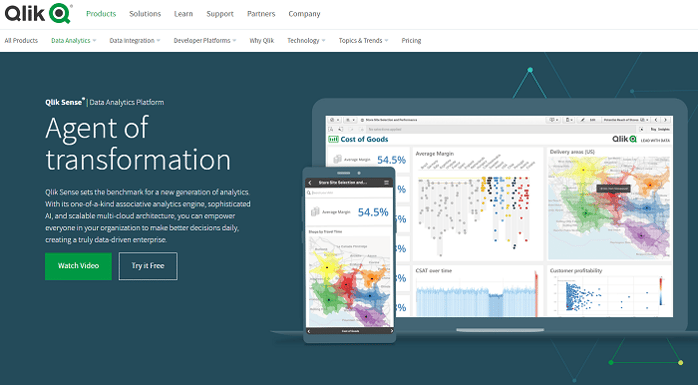
Combine and load data, create smart data visualizations with drag and drop feature.
Next generation analytics platform. Unique associative engine, powerful AI, and scalable multi-cloud. Bringing together all your data, and enabling your entire organization to explore with no pre-aggregated data or predefined queries to stop you.
Features include…
- Explore data on any device - global search and selections, smart visualizations, and more
- Associative Engine - limitless combinations of data from any source - uncover hidden insights
- Augmented intelligence - increase data literacy across your organization
- Enterprise-grade technology - deploy on premise or in the cloud
- Role-based access - according to specific security levels
Visme | Presentations & infographics
Create presentations, infographics, and reports with dynamic images and real-time data. Mix and match templates, icons, and fonts, to personalize your visuals.
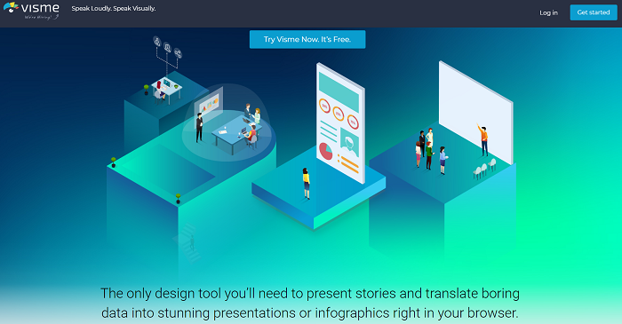
Tell visual stories in the form of presentations, infographics, and other visual content.
Features include…
- Full privacy control
- Access from any device
- 100+ fonts, millions of free images, thousands of icons
- Share online, embed on site, or download offline
- Add video, control playback, upload audio, record voice overs
- Animate objects, transitions, and pop-ups
Use Graph maker to visualize complex raw data, and turn into easy-to-understand visuals. Upload data from Excel or CSV to populate your charts, or connect to Google sheets for live data updates.
- Manage your team - add and track users
- Follow brand guidelines - personalize to your style
- Set permissions - choose user access levels
- Analyze and measure results - strengthen decision-making process
D3.js | Data visualization library
D3.js is a JavaScript library. It’s used to manipulate documents that are based on data. Powerful visualization illustrates your data using HTML, SVG, and CSS.
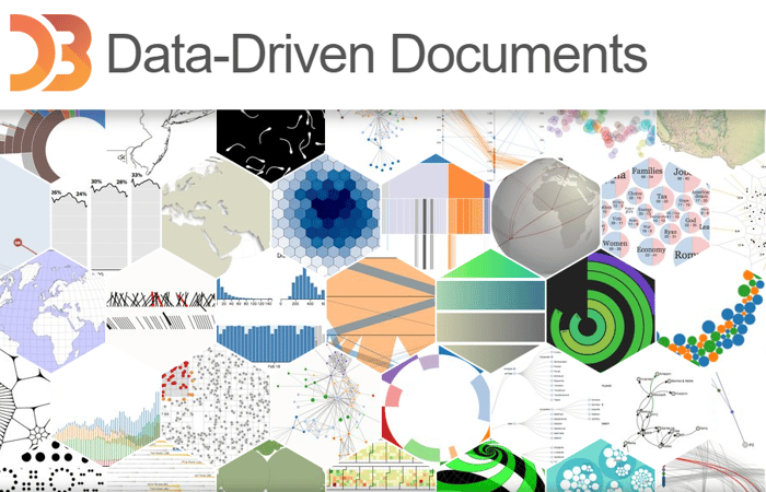
Supporting large datasets and dynamic behaviors for interaction and animation.
It’s the best known data viz library on the market, allowing developers to create complex charts and graphs.
RAWGraphs | Open source dataviz
Create custom vector-based visualizations, that are built on the d3.js library. Meaning? No coding skills required
You can upload your data into RAWGraphs in several ways…
- Plain text file - containing delimiter-separated values - CSV or TSV - using comma, semicolon, tab, or colon
- Copy and paste - from a spreadsheet - Excel, Google Docs, Apple Numbers, etc. - or a text file
- Type in directly - useful for editing your data
A Web app, your data stays on your computer, so it’s safe, even when using the online version.
Editing your visualizations is simple. Export the images in vector format - SVG - and open with a vector graphics editor - Adobe Illustrator, Sketch, Inkscape, etc. Your visuals can then be embedded in to any HTML page.
Check out the extensive glossary of data visualization examples. You can also add your own customized ones.
Infogram | Infographic & report visualization
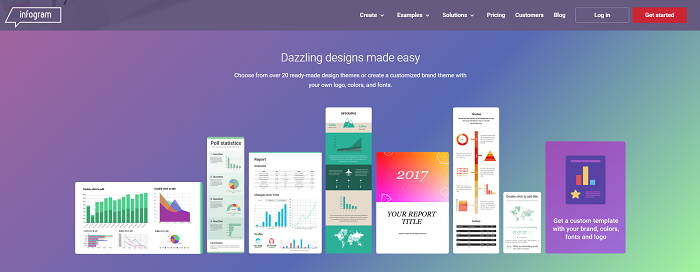
35+ charts, 550+ maps, 20 design themes, 1,000,000 images and icons.
Explain raw data with with an easy-to-understand visual - custom brand report or infographic. Fully responsive content, that’s interactive and embeddable. Share key metrics, business projects, and goals.
Features include…
- Free data visualization templates - ready-to-use visuals to save time and drive engagement
- Customized templates - follow your corporate identity with branded visuals
- Object animations - zoom, bounce, flip, fade, slide
- Interactive charts and maps - with tooltips, tabs, clickable legends, linking, and more
- Measure metrics that matter - detailed viewer demographics, average on-screen rate, shared content stats
- Custom tracking links - identify what parts of your content users are engaging with
- Responsive infographics - share across all devices
Free data visualization tools are few and far between, with Infogram you can create up to 10 projects for free. Awesome! The tool includes creative templates - that you can personalize - such as bubble graphs and pictorial charts.
Gephi | Open graph viz platform
Free, open source, data visualization and exploration software for data analysts and scientists to explore and understand graphs. Identifying patterns, structure singularities, or faults during data sourcing. Processing relational data - multiple tables of data - in social media. For instance, who’s following who.
Use ranking or partition data and create meaningful network representations. Customize the colours, size, and labels to make sense of the network representation.
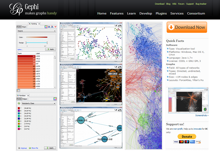
Open-source software for visualizing and analyzing, displaying graphics in real-time.
Features include…
- Real-time visualization
- State-of-the-art algorithms
- Exploratory data analysis
- Social network analysis - SNA
- Link analysis
- Dynamic graph analysis
- Dynamic filtering
- Ergonomic interface
Plotly | Open source visualization library
To create more complex visualizations. Yes, it’s built on the d3.js visualization library for JavaScript. Yes it integrates with Python, Matlab, and other programming languages. But it’s user-friendly.
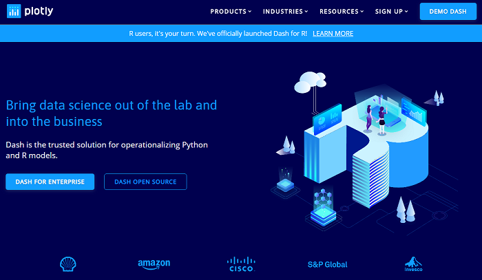
Bring data science out of the lab and into the business.
Start with a spreadsheet, and quickly create comprehensive charts.
Features include…
- Chart options - choose between 2D and 3D, enhance UX with interactive elements
- Open source coding - modify script to develop programs and features
- Personalize visuals - update colors and styles and apply your brand style
- Privacy settings - set edit and viewing privileges
- Integrate with existing workflow - export/embed static or interactive charts, graphs, and dashboards
FusionCharts | Web & mobile dashboards
100+ interactive charts, 2,000+ data-driven maps. Variety of charts, including Gantt, spider, waterfall, heatmaps, treemaps, Marimekko, and more.
Integrates with JavaScript, also with front-end frameworks such as jQuery, Ember, AngularJS, React, and back-end like PHP, ASP.NET, Django, and Ruby on Rails.
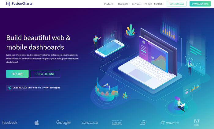
Data visualization tool to build Web and mobile dashboards.
Features include…
- Guides, tutorials, real-life examples
- Plots real-world datasets automatically
- Share charts across devices and browsers
- 20+ ready-to-use dashboards
- Bulk export of charts and dashboards
Google Charts | Free dataviz tool
Powerful, simple to use, and free data visualization tool.
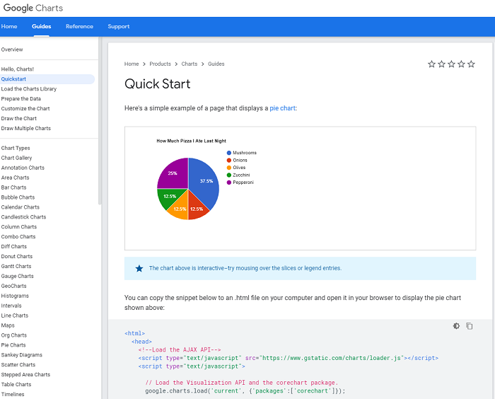
Populate with the DataTable class, means charts can be changed to alternative types.
This visualization API enables you to create charts and reporting applications over structured data. You can then upload these to your website.
Features include…
- Gallery of customizable visualization
- Interactive dashboard
- Cross-browser compatibility and cross-platform portability
- Real-time data
- Runs on HTML5 and SVG
- Available for Android and iOS
Chart.js | JavaScript charting
Basic, yet incredibly useful. It offers 8 data visualization charts…
- Pie
- Doughnut
- Line
- Bar
- Polar area
- Radar
- Bubble
- Scatter
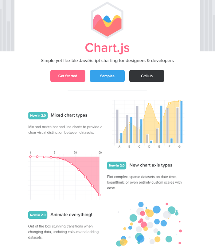
Data visualization library.
If you’re looking to build simple, interactive charts, it’s great. It does need some coding knowledge, though.
Zoho Analytics | BI reporting & analytics
Business data analytics platform for generating reports containing crucial business insights.
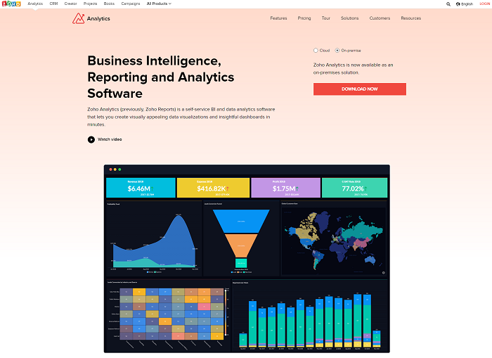
Discover hidden insights from your raw data.
User-friendly dashboards, easy to upload data integration and accessibility, and state of the art security with encrypted connection.
Features include…
- Combine data from multiple sources - create cross-functional reports and dashboards
- Visually analyze data - design reports and dashboards with drag and drop designer
- AI assistant - responds with answers in reports and KPI widgets
- Secure collaboration - share and publish reports with colleagues, add comments, hold conversations
- Embed analytics - embed reports or dashboards within your product, app, portal, or website
TimelineJS | Interactive timelines
Open source tool that enables you to create timelines from a Google spreadsheet. If you have JSON skills. You can create customized installations.
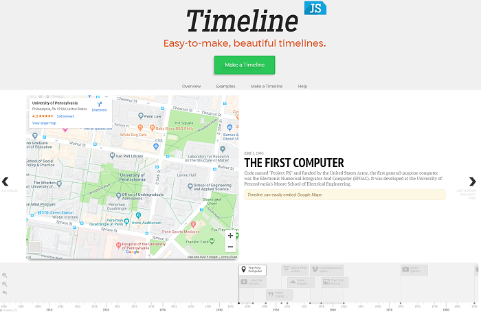
TimelineJS - free data visualization tool.
Media sources...
- Flickr
- YouTube
- Vimeo
- Vine
- Dailymotion
- Google Maps
- Wikipedia
- SoundCloud
- Document Cloud
- And more
You can create a timeline in four simple steps, and it’ll work on any site or blog…
- Create your spreadsheet
- Publish to the web
- Generate your timeline
- Share your timeline
Comes with a free spreadsheet template, in which you can drop dates, text, and links to media.
Simple!
Sisense | BI software solution
Makes data easy to digest. Bite-size pieces.
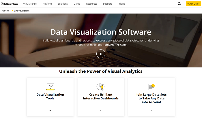
Dashboard widgets - scatter plots, gauges to measure KPIs, heatmaps, pivot tables...
A business intelligence platform with which to visualize your data, leading to the ability to make more intelligent business decisions. Combine historical data analysis and predictive analytics to improve your strategies.
You can build dashboards and graphical representations, with a simple drag and drop UI. Once created, share with your organization, partners, and clients.
Features include…
- Real-time data and trend tracking
- Interaction with Sisense products
- company -based pricing
- Interactive dashboards
Takeaway
Once you’ve visualized your data, you can start digging for insights. Monitor and analyze patterns and trends. These will indicate areas where you can jump in and promote your products, or address any issues.
Data-based marketing campaigns will increase brand awareness, trust, loyalty, and sales for your business. Data visualization lends context to your business decisions. And remember…
- 80% of people remember what they see, compared to ten percent of what they hear and 20 percent of what they read
- 90% of the information processed by our brains is visual
- It takes only 13 milliseconds for our brains to process an image
- Our brains process images 60,000 times faster than text
Take a look at Talkwalker’s data visualization tool. Check out our PR Crisis eBook, and see how it performs in real life.

